What Makes a Good Website? 4 Factors Every Business Should Consider
Most business owners want their websites to “look good.” But here’s the truth… You could have the most beautiful website and still struggle to convert leads.
Aesthetics is one factor of a good website. But an aesthetic website does not mean a usable website. So what makes a good website?
To create an effective website for your business, you need to get four things right: functionality, practicality, aesthetics, and accessibility.
In this article, I’ll explain each of those factors so you can identify what your website needs or might be missing. By the way, if you don’t have a website for your small business yet, read this article to find out if you really need one.
Table of Contents
Functionality: Does your website fulfill its purpose?
Functionality refers to the usefulness of your website and how well it achieves your business goals or its intended purpose.
You might build a website for a variety of reasons, such as:
- To generate enquiries,
- book appointments,
- showcase a portfolio,
- sell products, or
- grow an email list
The first step in web design is to understand and define your primary objective. The website layout and content should be structured to support that goal.
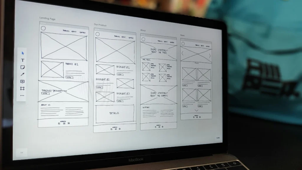
Some may hear “functionality” and think of contact forms, interactive elements, Instagram feed, etc. These are features or capabilities that enable website functionality. In the context of this article, functionality refers to a broader concept of usefulness — whether the website helps users complete the action it was designed for.
Signs your website lacks functionality
If your website is receiving sufficient traffic but failing to deliver results, it may be time to assess how well it serves its functionality.
Below are some examples of functionality issues:
- Visitors aren’t taking any action.
- Important information required to complete the website’s purpose is missing. For example, a local restaurant without an address or opening hours could be turning away valuable customers.
- The website doesn’t guide visitors towards the next logical step, be it enquiring, booking, purchasing, or subscribing.
- The website doesn’t have key pages (such as services or a contact page), or it doesn’t answer the questions visitors often have before they make a decision.
- The website lacks a primary call-to-action (CTA) or has too many competing CTAs.
- Essential features needed to achieve the website’s goal are missing or not working as intended. For example, a clinic that relies on appointments without a proper online booking system.
Your website can be visually appealing and technically sound, but still fail to move people toward the action you need them to take. That is usually a functionality problem.
Practicality: Is it easy for visitors to use?
Practicality is essentially usability. It means how easy and intuitive a website is for the end user to achieve what they need.
To assess how practical your website is, start with the key actions you want the users to take. Then consider how it connects to actual user needs when they land on your website. This can help you identify what to prioritise and whether your structure and content are working in your favour.
A practical website has clear navigation, a logical information hierarchy, a smooth user experience, and as little friction as possible between the visitor and the action you want them to take.
You can check how usable your design is through usability testing. If you have room in your budget, conducting a test during or after the web design process can help you gain valuable feedback from users and find out what’s working and what’s not. Just make sure to select participants who represent your end user.
Common practicality issues that frustrate users
Usability is a significant revenue-draining factor for a business. Websites that ignore it can drive visitors away without you even realising what’s happening. The tiniest issue can affect how a user experiences your website.
Here are some of the most common practicality issues:
- Pages have slow load times.
- The design doesn’t adapt to different screen sizes.
- Completing a simple action requires too many clicks or steps.
- Navigation is unclear. For example, if the link for the current page looks the same as the others, visitors may struggle to tell which page they are on at any given time.
- Important information is buried, forcing users to hunt for things they expect to find quickly.
- No visual feedback when a user takes an action, such as submitting a form or adding an item to a cart, leaving them unsure whether it worked.
- Design flaws that visually mislead a user. For example, a static element that looks clickable when it’s not, leading to dead clicks.
… and the list goes on.
It might not be possible to avoid all usability traps. That’s why it can be helpful to conduct user testing or track actual user behaviour using session recording tools or visual heatmaps, like Microsoft Clarity or Hotjar.
Aesthetics: Does your website create the right impression?
By “aesthetics,” I’m not talking about something as abstract as looking or feeling beautiful. After all, beauty is subjective and cannot be truly measured. Rather, aesthetic here refers to a specific visual style tailored to your target audience and business category.
This is one of those things that so many business owners get backwards. You might have pretty brand colours, fonts, and images on your website. But if you don’t earn your audience’s trust, it’s a moot point.
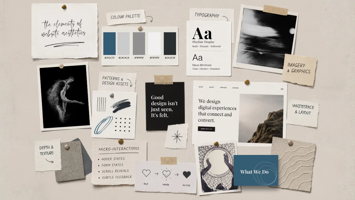
So, what shapes your website’s aesthetic? It’s the composition of visual elements that make your website whole, such as:
- Colour palette
- Typography
- Imagery and graphics
- Patterns and other design assets
- Whitespace and layout
- Depth & texture
- Animations and micro-interactions
Each of these works together to create an impression that determines whether a visitor trusts your business enough to take the next step.
Signs your website has an aesthetic problem
Aesthetic issues are not always obvious, especially when you’re too close to your own brand. And even if you realise it, it may be hard to pinpoint what’s holding the design back.
Here’s a list of some of the aesthetic issues that often arise:
- Branding and visual elements are inconsistent across pages. These can range from too many fonts to clashing colours, or varying image styles that make the site feel disjointed.
- The design doesn’t consider the business category. Some industries rely on visual conventions that visitors recognise and trust. Breaking those conventions could have a negative impact. For example, a financial services firm or an education platform that focuses on innovative web design over clarity can be unsettling.
- The aesthetic doesn’t match the target audience. A luxury brand that looks budget, or a children’s brand that feels corporate, creates an immediate disconnect before a word is read.
- The design is dated. An outdated website signals to visitors that the business may not be keeping up in other areas either.
- Decorative choices or cluttered layout get in the way of usability. Aesthetics should support the website’s functionality, not compete with it.
One thing I’d like to add is that aesthetics can hurt the usefulness and usability of your website. What’s worse? There’s a psychological phenomenon known as the aesthetic-usability effect that can impact user perception. This suggests that people tend to overlook or forgive minor problems if a design looks attractive. While that may sound like a good thing, it can mask real bugs or red flags in your design that could be costing you money.
Accessibility: Can everyone use your website?
This is one of those areas that business owners, and unfortunately, even designers, often overlook. When hyper-focused on designing an aesthetic website, we don’t always consider if it is actually accessible.
Web accessibility means designing and developing websites that everyone, including people with disabilities, can use and interact with. By accounting for various users and conditions, you can create a website that benefits more people than you think. These may include:
- Users who rely on screen readers or keyboard navigations
- Older or non-tech-savvy users
- Mobile users
- Temporary impairment or disabilities
- Slow internet connections
- Situational limitations (such as a dark environment or loud surroundings)
Common accessibility issues that ruin user experience
Did you know that websites can get sued over accessibility issues? So, it’s safe to say that keeping accessibility in mind is non-negotiable.
The following are some of the most encountered accessibility issues in web design:
- Visitors may struggle to see your content due to small font sizes or insufficient colour contrast.
- The website is difficult to navigate using only a keyboard or a screen reader.
- Images lack descriptive alternative text, which makes visual content inaccessible to screen reader users and if images fail to load.
- Videos with audio don’t include captions or transcripts, making them inaccessible to people who are deaf or hard of hearing.
- Buttons and links do not provide enough context or contain vague labels, such as “Click here” or “Go”.
- Interactive elements have small touch targets, making them hard to use on mobile or for visitors with limited dexterity.
- Important information relies solely on colour, making it difficult for some users to distinguish between states or messages. For example, forms that don’t clearly identify errors and required fields can be frustrating to complete.
Accessibility is no longer just the right thing to do. It directly impacts how many people can find, use, and convert on your website.
Key takeaway
If you have a website that looks appealing and works just fine, you might be tempted to call it a day. However, all four of the factors that we’ve discussed in this article – functionality, practicality, aesthetics, and accessibility – play a distinct role in creating a great website and user experience. A website that does three out of these four right can still underperform because of the one it neglects.
A functional website that’s difficult to use will frustrate visitors before they convert. A practical website with weak aesthetics may fail to build trust with its audience. A visually strong website that ignores accessibility is excluding a portion of its potential audience. And a website that ticks all three but lacks a clear path to action may attract visitors who have no idea what to do next.
Finding the right balance can be tricky. But that’s what separates a website that looks good from one that actually works.
If you’d like a second pair of eyes on your current design with a website audit, or you’re ready to build a website that considers these four factors, let’s chat.