How to Create a Brand Identity: A Complete Step-by-Step Guide
Building a brand identity is one of those things that sounds easy until you actually start doing it. Without a clear process early on, you may find yourself spending time and money going in circles.
In this guide, I’ll walk you through how to create a brand identity for a business. If you’re a business owner trying to DIY your brand identity or a brand designer learning the ropes, you’re in the right place.
You’ll learn a step-by-step breakdown of the exact process, key decisions, and some of the most common mistakes to avoid before you make them. Here’s a quick glance at the steps involved:
Table of Contents
Brand identity is a combination of visual and verbal assets intended to help a brand be easily recognised and perceived favourably by its ideal audience.
If you’re a complete beginner to brand design, I’d recommend familiarising yourself with the key elements of a brand identity and determining if you need one right now.
Step 1: Clarify your brand direction
I know it’s tempting to jump straight into designing your visual identity. But before you touch a single design tool, you need to be clear about your brand direction.
A compelling brand identity is built on a multitude of factors — your target audience, ideal market positioning, brand personality, and core values, to name a few.
Creating a comprehensive brand strategy can help you set up a solid brand foundation. But if you’re bound by cost or time constraints, you could opt for a simple brand brief that provides a quick overview of your brand (grab the free template below).
What to do:
Your brand direction directly influences and shapes what your brand should look and sound like.
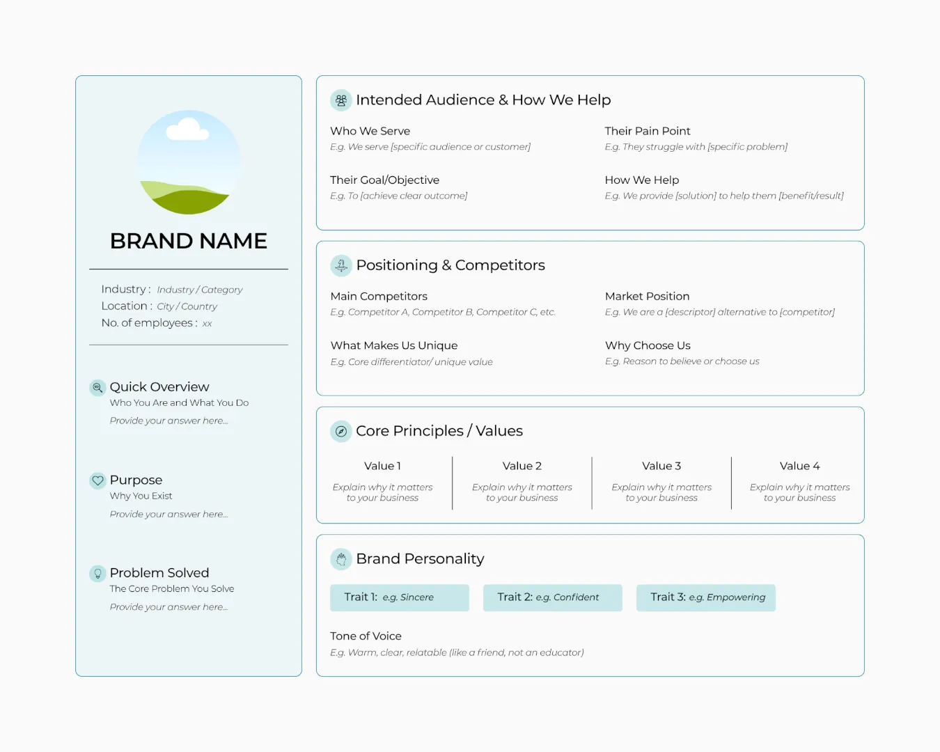
Think of a brand brief as a user persona, but for your business. It acts as a quick reference tool you can revisit anytime you get stuck and need to make a decision. Take some time to jot down the essentials:
- Quick overview of your business and why you exist
- Intended audience and how you help them
- Positioning in terms of current competitors
- Core principles or values you live by and uphold always
- Personality traits or adjectives to describe your brand
Be specific when doing this. Steer clear of ambiguous or vague ideas. This will ensure you have something concrete to work with in the next step.
This is also the right time to finalise your brand name, if you haven’t already.
What to avoid:
The most common mistake here is assuming that what you want is what your ideal audience wants. A brand should be built around your audience’s preferences, and not just yours.
It’s become common practice for brands (especially personal brands) to be super ”authentic”. But if it disregards your customers’ perspective, you might end up pushing them away.
Your brand exists in the minds of your audience. Focus on designing a memorable brand that they can trust and keep coming back to.
Step 2: Define your visual direction
Before you swipe colour palettes off Pinterest or Instagram, let me stop you. You need to establish a visual direction first.
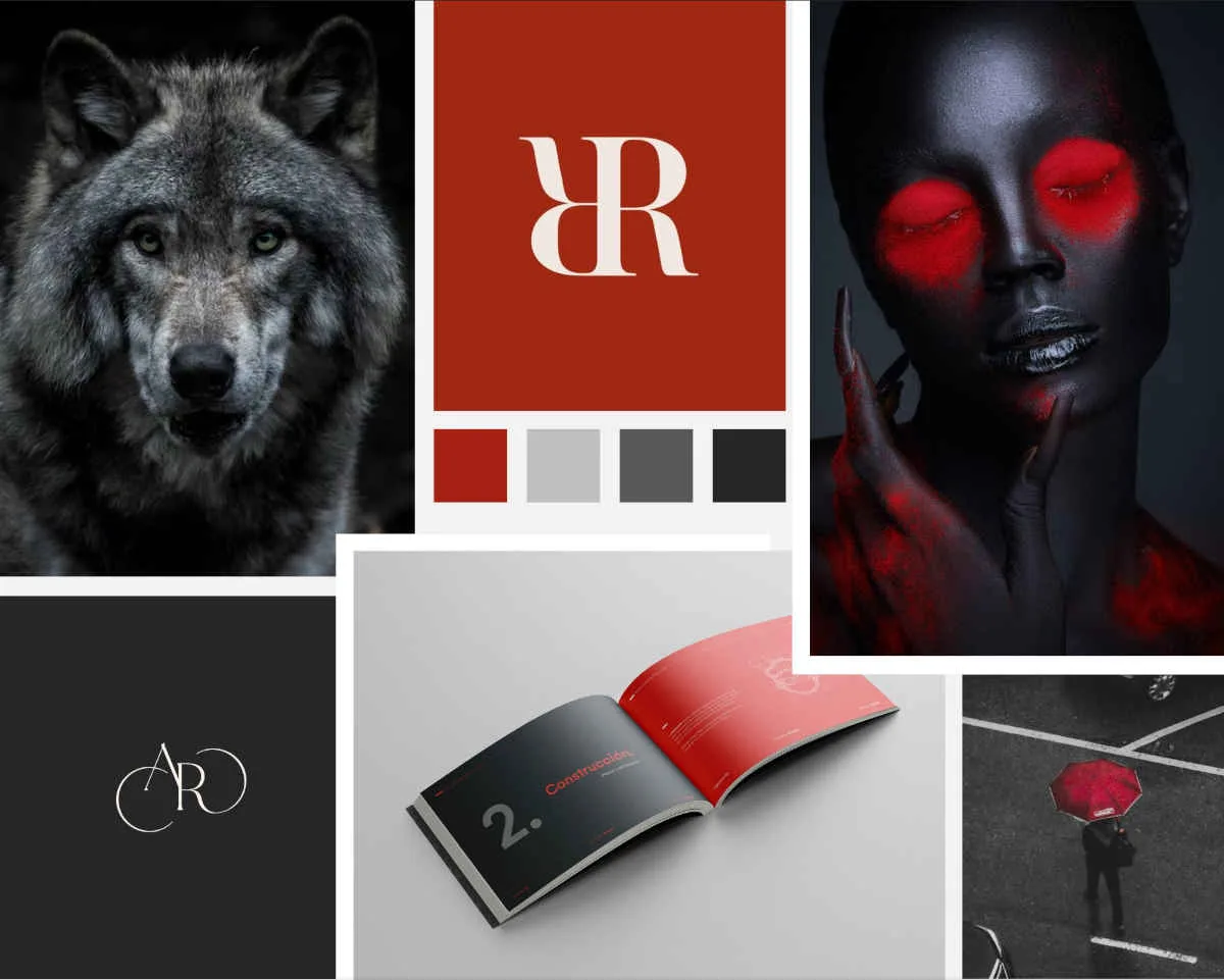
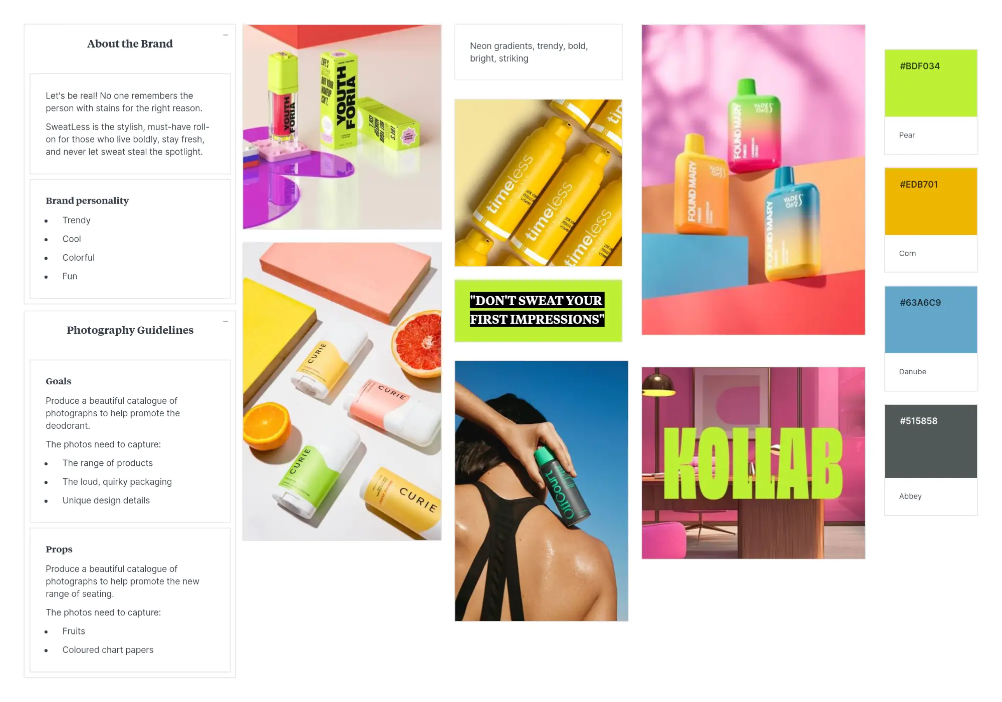
A mood board is a visual tool that allows you to define the artistic direction, style, and emotional feel you want your brand to convey. It can help you and your team make better decisions and ensure design consistency.
If you’re a solopreneur and the sole decision-maker, one mood board is usually enough. But if you have a team or want to explore options, I’d suggest creating 2-3 mood boards. Anything over three could make it difficult to settle on one option.
What to do:
You can create a mood board on Canva or your preferred design software. Or you could create a board directly within Pinterest and pin designs you like.
Gather as much inspiration as you can from various platforms. Don’t overthink it — save or pin anything that catches your eye.
A few of my go-to sites for brand identity inspo are Pinterest, Instagram, Dribbble, and Behance. For imagery, my top choices are Pexels, Dupe Photos, Unsplash, Canva’s stock library, etc.
Before you put together the mood board, collect all the inspo on a single page. Try to include the following:
- Logo styles you’re drawn to
- Images and visuals that capture your brand’s aesthetic
- Background textures or illustrations
- Brand collateral, like packaging design, stationery, or signage
Once you’ve collected enough, step back and look at the page as a whole. Ask yourself:
- Does it lean towards a specific design style?
- Is it consistent with your brand brief?
- Does it evoke the emotion you want your brand to convey?
Remove anything that doesn’t belong. From what’s left, pick around 5–8 strongest pieces to form your final mood board (as shown in the example below).
By this point, you should also have a rough sense of the colour theme you’re leaning towards — hold onto that thought for Step 4.
If you’re extremely busy or feeling lazy to go through all this, there’s a quick way to do this…
Simply drop the brand brief you created earlier into an AI tool and ask it to generate a mood board for you. However, it may not be as tailored or comprehensive as the one you curate yourself. You can also add a few images that match your brand theme to produce better output and maintain more control over your brand’s visual direction.
What to avoid:
Avoid cramming or mixing too many styles in a single mood board. Every mood board should have a clear theme, whether that’s sophisticated and chic or playful and fun. A mood board featuring hints of polar opposite themes could result in a chaotic and unusable creative direction.
Step 3: Design a unique logo
A logo is one of the first things people notice about your brand. It should be unique, easily identifiable, and above all, practical.
Canva and online logo makers are a popular choice for DIYers. They’re quick and affordable, but there’s a catch. Since these tools rely on shared templates and stock elements, someone else could end up with a logo that looks nearly identical to yours. They also tend to fall short in capturing the personality and nuances of your brand.
If uniqueness and brand alignment matter to you, consider working with a professional designer. Using vector-based software like Adobe Illustrator or Inkscape, a designer can create a custom logo that aligns with the visual direction defined earlier.
What to do:
There are several types of logos — wordmarks, lettermarks, pictorial marks, abstract marks, combination marks, and more. The types of logo you need will depend on your brand, industry, and how and where it will be used.
During the design process, work in grayscale (black or white shades only). The absence of colour is an effective method to explore unique ideas and push your creativity.
Before finalising your logo, ensure it works well across several practical applications, such as:
- Your website header
- Social media profile picture
- Business cards and print materials
- Packaging, signage, or merchandise
- Light and dark backgrounds
A logo that looks great on a website header may be illegible as a favicon (the tiny icon on browser tabs). And a logo that’s visible on a solid background may not be clear as an image overlay.
Once you have a logo you’re happy with, there’s one additional step to do — check if your logo is unique.
Upload a black-and-white version of your logo to Google Lens and the Global Brand Database to ensure it doesn’t closely resemble any of the existing ones. Not to be that person… but otherwise, you might inadvertently leave yourself open to a lawsuit.
What to avoid:
The most common mistake is designing for aesthetics rather than usability. A logo needs to work across physical and digital formats, screen sizes, backgrounds, and applications. If your logo isn’t versatile enough to adapt to them, it can create practical problems down the line.
Another mistake I’ve seen worth flagging is the use of handwritten, calligraphic, or extremely stylistic fonts. While they may seem appealing, they can be difficult for others to read and distinguish between the letters. If people can’t read it, they can’t remember it.
Step 4: Build your colour palette
We see colours all around us. So how can a brand use colours to draw attention and be recognised in an instant? Although it may seem like it, building a colour palette for your brand isn’t just an aesthetic choice.
Brand colours actively shape how a brand is perceived. The right colour palette can evoke an emotional connection in your audience and reel them in before they even read a single word you have to say.
This is a critical step in the brand design process, mostly because so many things could go wrong without a concrete plan.
What to do:
Building a flexible colour palette requires considerable time and effort. But the good news is, if you’ve been following along, we’re already halfway through our palette-building.
Remember the mood board we created in Step 2? You should notice a colour theme emerging from it. Now, it’s just a matter of selecting and assigning roles to the colours.
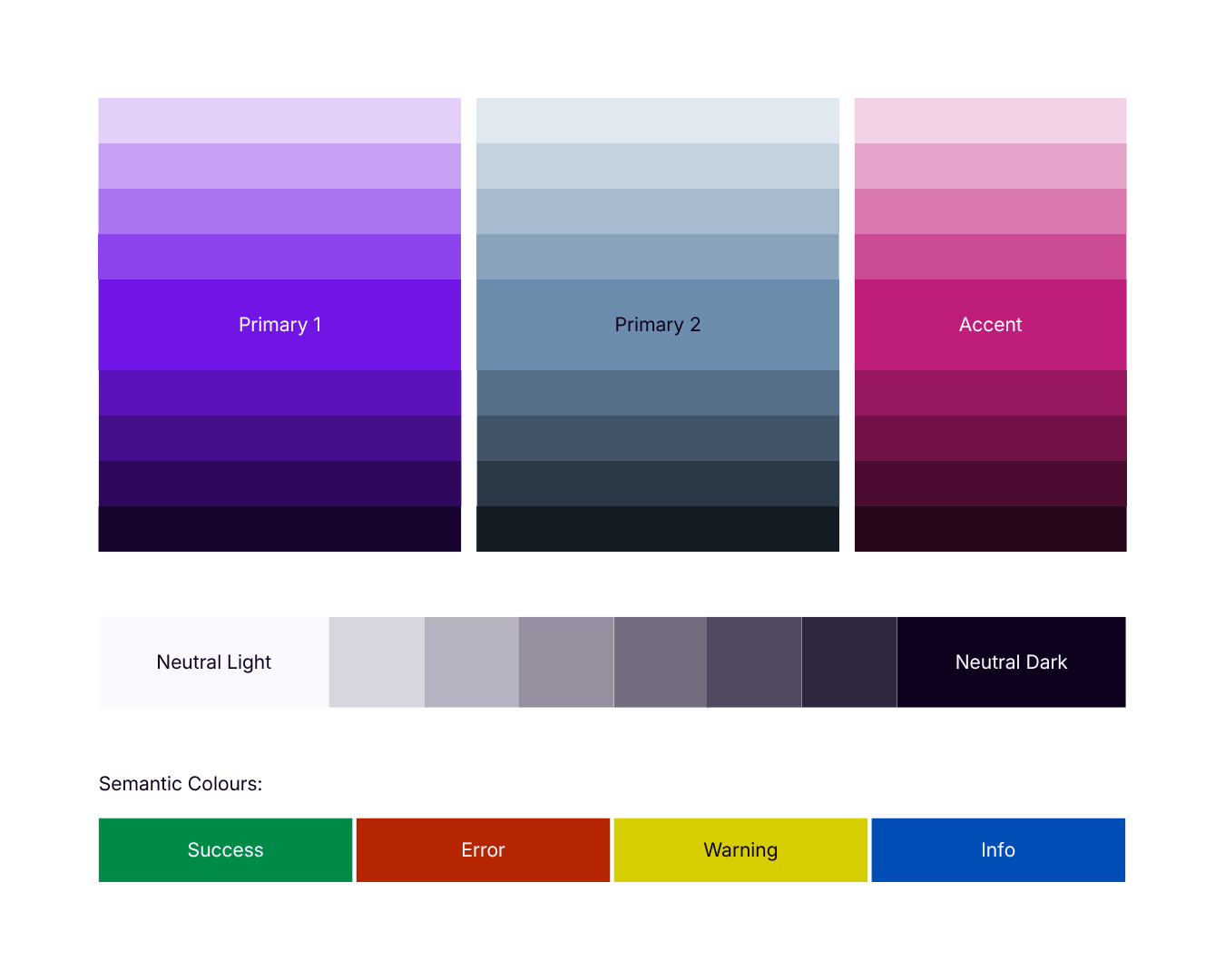
Here’s a simple categorisation you can follow:
- Primary colours (1-2 max) – These are the colours most closely associated with your brand. They’ll appear most frequently across all your brand assets.
- Secondary colours (optional) – If you want a more comprehensive colour scheme, you can add secondary colours. But keep in mind that these should complement your primary colours, without competing with them.
- Accent colour – Use this to give a pop of colour or draw attention to specific areas of the design. It could be used for call-to-action buttons, highlights, or other elements that need to stand out.
- Neutral colours (light and dark) – These are neutral colours used mostly for backgrounds and text. If you opt for black and white colours, use different tints and shades rather than pure black (#000) or pure white (#FFF).
Play around with the colours to refine your palette even further.
If you want to save time, you can use a colour palette generator like Coolors or ColorSpace.
Pro-tip: When using Coolors, rather than letting the tool determine the entire colour palette, add one primary colour of your own. Then, hover over the colour you added and toggle the lock. Then you can generate new variations with your chosen colour in place.
Now that you have your main brand colours, there are two more categories left to consider:
- Extended shades and greys – Extend your existing palette with a range of tints, shades, and tones to ensure a wider colour expression. These are particularly useful for UI design or low-emphasis elements such as overline, divider, forms, background elements, etc.
- Functional/semantic colours – These are the standard indicator colours that are widely understood. For example, red and green for error or success notifications on a website or app. They serve a specific purpose and should be used consistently across all touchpoints.
Accessibility matters here. Determine how each colour would be used in a real-world application. Make sure there’s sufficient contrast between your text and background colours. Tools like WebAIM Contrast Checker, Color.review, and ColorShark can help you verify this quickly.
What to avoid:
The biggest mistake you can make here is disregarding a neutral colour system. Without neutrals to ground them, even a beautiful set of colours can produce a cluttered and overwhelming visual identity.
Another pitfall is inconsistency. Avoid using different colours for similar elements across platforms or materials.
Finally, don’t overlook accessibility. A colour palette that fails contrast requirements isn’t just a design problem; it excludes a portion of your audience entirely. Build accessibility into your palette right from the start, not as an afterthought.
To that point, I’d like to reiterate that while it’s common to see brands opt for pure black and pure white, it’s best to avoid doing so. They can create a harsh contrast and cause eye fatigue, which is yet another accessibility concern.
Step 5: Pick the right typography
When you flip through a magazine or visit a website, you might have noticed how the content comes alive through typography. Typography refers to the art and technique of arranging fonts to make written communication visually appealing and effective.
Good typography can reinforce your brand personality, guide the reader’s eye, and even make content easier to consume. The wrong one, on the other hand, does the opposite and may seem off-putting.
Typography involves various elements like alignment, leading, and tracking. But we won’t be covering those today. In this post, we’ll focus on how to pick the right typefaces or font pairings for your brand.
A typeface is the overall artistic design of the characters (e.g., Arial, Times New Roman), whereas a font is the file containing the specific weight, width, or style within a font family (e.g. Arial Regular, Arial Bold, Arial Italic).
What to do:
Similar to how we used categories for the brand colours, we can break down font pairings based on their roles. A solid brand typography system typically consists of three roles:
- Heading font – Headlines are the largest and most prominent text on a screen or page. Choosing a good heading font can set the tone, personality, and mood for your brand. You’re allowed to be a little expressive here.
- Body font – This is usually reserved for long text and carries the bulk of your content. The non-negotiable factor here is readability across different sizes.
- Accent font – Although optional, this can be useful for highlighting captions, pull quotes, or decorative text and distinguishing them from other content. They should be used sparingly.
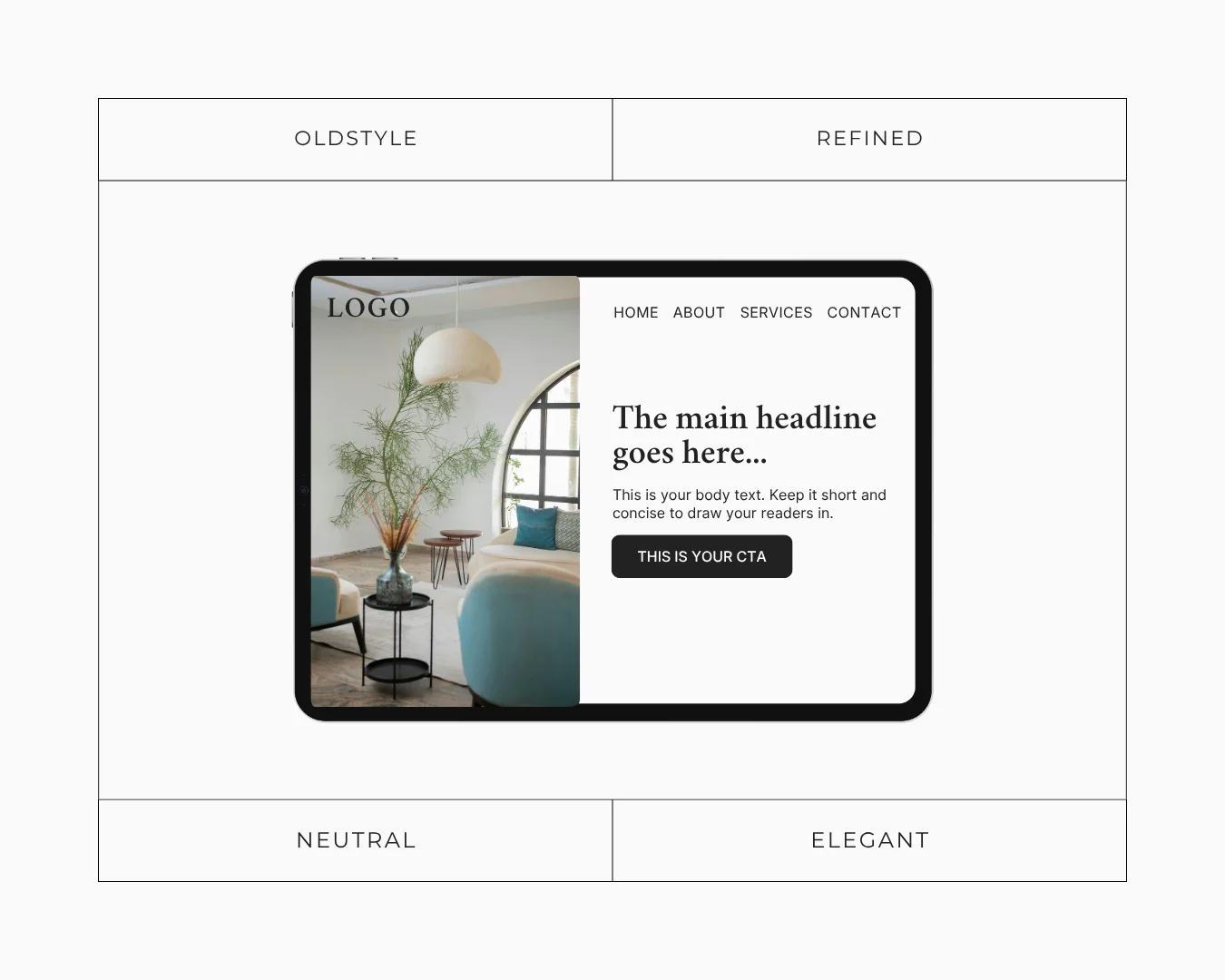
When pairing fonts, consider how the typefaces balance contrast and cohesion. Put it to the test in a real-world application to see how well they work together. You can quickly create a mock website hero section in Canva, Figma, or other design software, as shown below.
To ensure you’ve picked a suitable typography for your brand, compare it with the personality traits and characteristic adjectives defined in Step 1. Does it match the vibe or kill it?
To ensure the chosen typefaces are readable and legible, always test your choices at multiple sizes and on different devices before committing.
Pro tip: When choosing a typeface, always look at the number of available styles (regular, semibold, bold, italic, etc.). It opens up the possibility to create a more impactful hierarchy within your typographic system.
Nowadays, variable fonts are also widely available. This provides you with the flexibility you need without adding individual font files. It allows you to set a range of weights and styles, while keeping your typography system lean and consistent.
What to avoid:
Using too many fonts can quickly make your brand feel scattered. Stick to two or three at most to avoid distracting users.
When it comes to handwriting, script, or decorative fonts, don’t rely on your judgment alone. Some look beautiful at a glance but create serious legibility issues. Before finalising one, ask someone else to read it without prompting. If they hesitate or misread anything, there’s your answer.
Some sans-serif and serif fonts also make it hard to tell certain letters apart, rendering your text unreadable. Some of the common culprits include characters such as:
- uppercase i (“I”), lowercase L (“l”), and “1”
- “O” and “0”
- “B” and “8”
- “r” and “n”
Finally, be wary of trendy fonts that don’t age well. Ultimately, your brand identity should be built to last.
Step 6: Define your imagery & graphic style
It’s easy to overlook imagery when creating a design system. Yet, it is one of the most powerful tools in a brand identity toolkit.
Before a potential customer explores your offer, they form an impression of you based on what’s immediately visible to them. That means your imagery and design assets are just as important as your colour scheme and typography.
Imagery and graphics are extremely effective at communicating your personality and drawing the attention of your ideal audience. Defining this early on can help you maintain consistency throughout multiple touchpoints and in your marketing materials.
What to do:
Start by defining your photography style. This goes beyond simply choosing between stock images or custom brand photography. You need to think about how to establish a visual language that’s unmistakably yours. Consider the following:
- Mood and lighting — Are you drawn to bright, airy visuals or moody, dramatic tones?
- Style — Do you have any particular theme, such as candid, lifestyle-driven, or editorial?
- Subjects and composition — Do you lead with people, products, emotion, or environments?
- Props and backgrounds — What recurring elements will anchor your visual identity?
- Stock imagery — When choosing stock photos, what characteristics can make them feel less generic and more cohesive with your brand?
If you work with a photographer or plan to shoot content regularly, put together a photoshoot brief. It doesn’t need to be elaborate. A one-pager outlining your brand goals, preferred style, and non-negotiables can make a huge difference in keeping your visuals consistent over time. I personally enjoy using Milanote for this purpose.
Aside from photography, think about the broader graphic elements that will appear across your brand:
- Iconography — Do you prefer flat, outlined, or gradient icons for your website or social posts?
- Illustrations — Do you use them at all? Is there a preferred style — cartoon, line drawings, or 3D?
- Patterns and textures — Do they feature in your designs, and if so, how prominently?
- GIFs and motion graphics — Are they part of your brand language, or do you prefer static visuals?
Whichever direction you choose, make sure it reflects your brand and resonates with your audience.
What to avoid:
Inconsistency is the most common and damaging mistake here. Using different visual styles across platforms can send mixed signals to viewers and diminish trust in your brand.
Busy or distracting imagery is another major pitfall. Consider what you want the imagery to represent, and make sure every image has a focal point. Your audience should be able to make sense of the content and context at a glance.
Finally, make sure your chosen style actually fits your brand. A chic, luxury brand using cartoon-style illustrations or a children’s brand using dark, editorial photography are clear examples of a mismatch. It can confuse your audience and undermine everything your identity is trying to communicate.
Step 7: Establish voice and tone
You should have all the basic visual components of brand design by now. But your identity isn’t complete without defining how it sounds. While the visual identity tells people what your brand looks like, your verbal expression tells them what it’s like to interact with you.
Brand voice and tone are the core elements of verbal branding. They help convey your personality, values, and character to your desired audience through written or spoken communication.
The voice reflects a brand’s inherent personality or style, and as such, is meant to be consistent. For example, your brand voice might be confident, warm, witty, or direct. Tone, on the other hand, is how you convey a message to your audience and can shift depending on the context. For instance, the way you promote a product launch would be different from how you handle a customer complaint.
What to do:
Start by defining your brand voice. Use the personality traits you identified in Step 1 as your anchor. If your brand is bold and direct, your voice should reflect that. If it’s warm and conversational, that should come through in every line of copy you write.
From there, consider the following:
- Communication style — Is your brand formal or casual? Neutral or expressive? Playful or authoritative?
- Sentence style — Do you write in short, punchy sentences or longer, more descriptive ones?
- Vocabulary — Are there words or phrases your brand naturally uses? Are there any buzzwords or expressions you would never use?
- Catchphrases or recurring language — Do you have signature phrases that make your brand instantly recognisable?
Some people think the job is done after developing a brand voice. They might assume they can make up the tone as they go since it’s context-dependent.
But let me ask you… Have you seen businesses that seem good throw a nasty attitude when responding to comments or customer reviews? This happens more often than we think and can hurt brand reputation. If you’re prepared for different scenarios, it’s easier to keep yourself in check at all times.
Once you have a sense of your voice, create simple tone guidelines for different situations. How does your brand sound on social media versus a formal announcement? How do you speak to other businesses or react to unfavourable customer feedback?
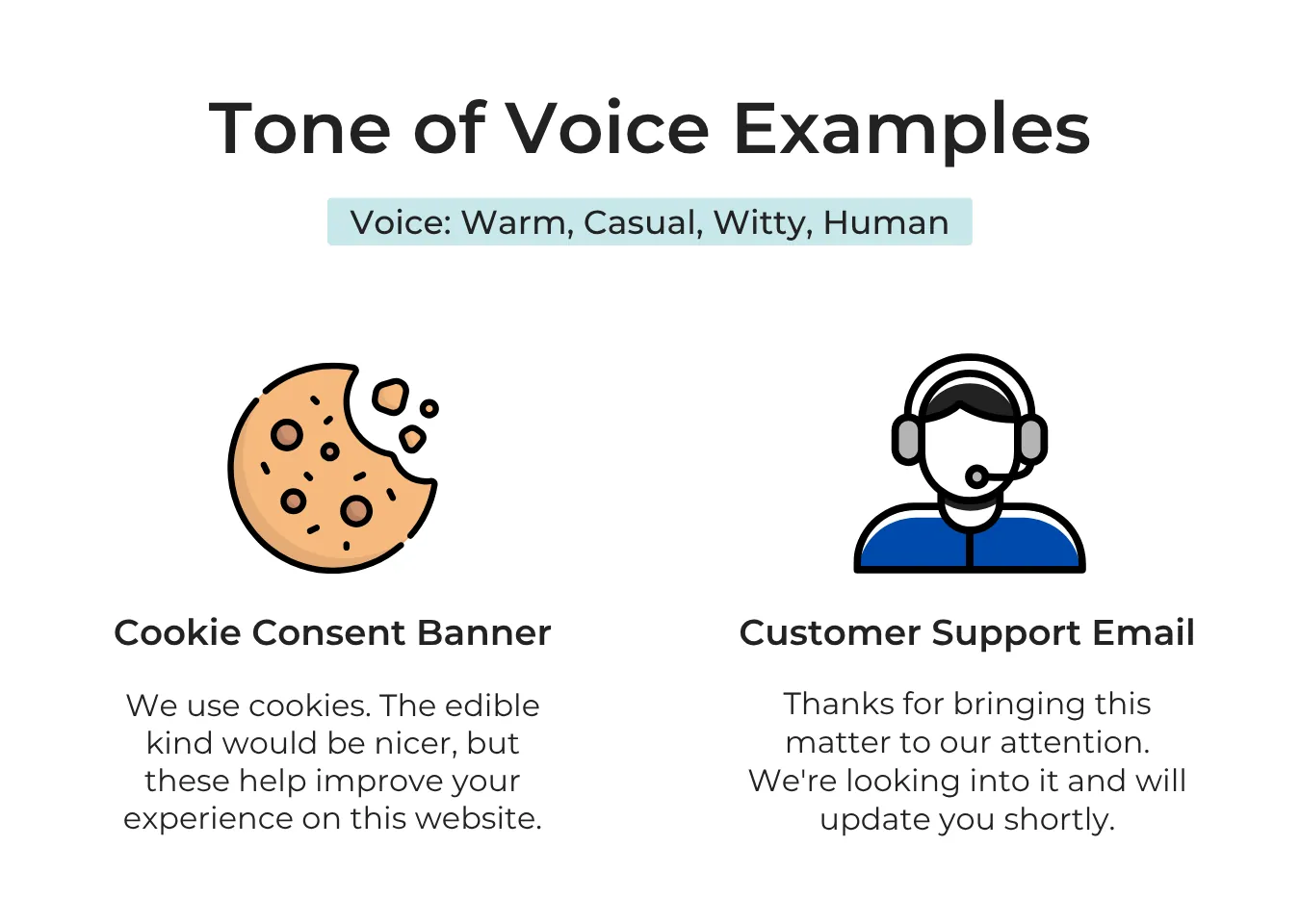
Clearly define all the points mentioned above in a document. Also, add a few examples to illustrate what your brand would say, and what it would never say. This can be handy in keeping your communication consistent, especially if you engage others to write on your behalf.
With your voice and tone clarified, you have everything you need to write an impactful brand story, a sharp elevator pitch, or website copy that actually sounds like you.
What to avoid:
Resist the urge to sound like every other brand in your industry. Mimicking your competitors might seem like a safe option, but it can also make your brand invisible. Think about ways to use voice as a key point of differentiation, rather than defaulting to a generic one.
A common trend now is for every brand to be relatable and witty. I’m not saying that you shouldn’t be. But when determining your brand voice, think carefully about whether it actually suits your personality and how well it would land with your customers.
The other common mistake is inconsistency. You might use stiff, corporate language on your website, but switch to a playful, casual tone on Instagram. Even if they can’t pinpoint why, this can give your customers a feeling that something is off. If your brand sounds completely different from one touchpoint to another, it can weaken trust and recognition.
Key takeaway
Building a brand identity is a process, not a one-time task. A solid one should serve you for several years but still evolve with your brand and audience.
If you’ve followed the steps in this guide, you’re already ahead of most. But knowing the process and executing it well are two different things. The further you get, the more decisions there are and the easier it becomes to second-guess yourself.
If you find yourself stuck or don’t have the time to create a brand identity that’s cohesive from the start, that’s usually where it can help to have someone like me in your corner.
Before you go, remember that all good things take time. Just be consistent and patient with it.